Case study · Hospitality
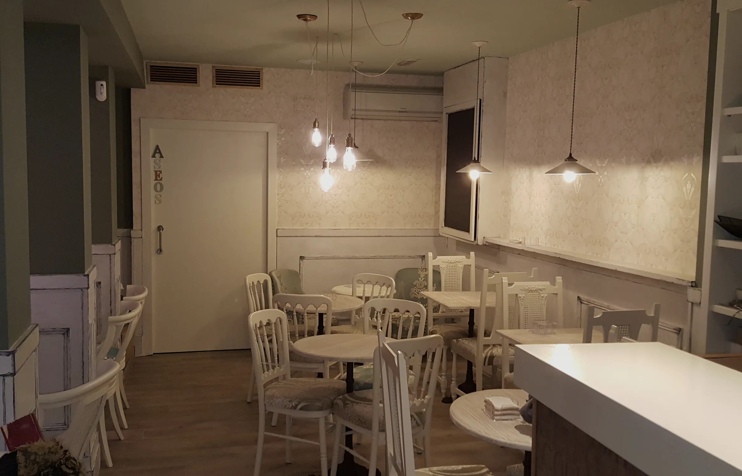
A creative patisserie opening on the most central square in Vitoria, determined not to look like any of the others: no pink, no flowers, no pastel. The brand was ready before the shop was.
The client
La Crème is a creative patisserie and coffee shop on Plaza España in Vitoria-Gasteiz: custom cakes, cupcakes, cookies, cakepops and dessert tables, in premises with an interior design project of their own.
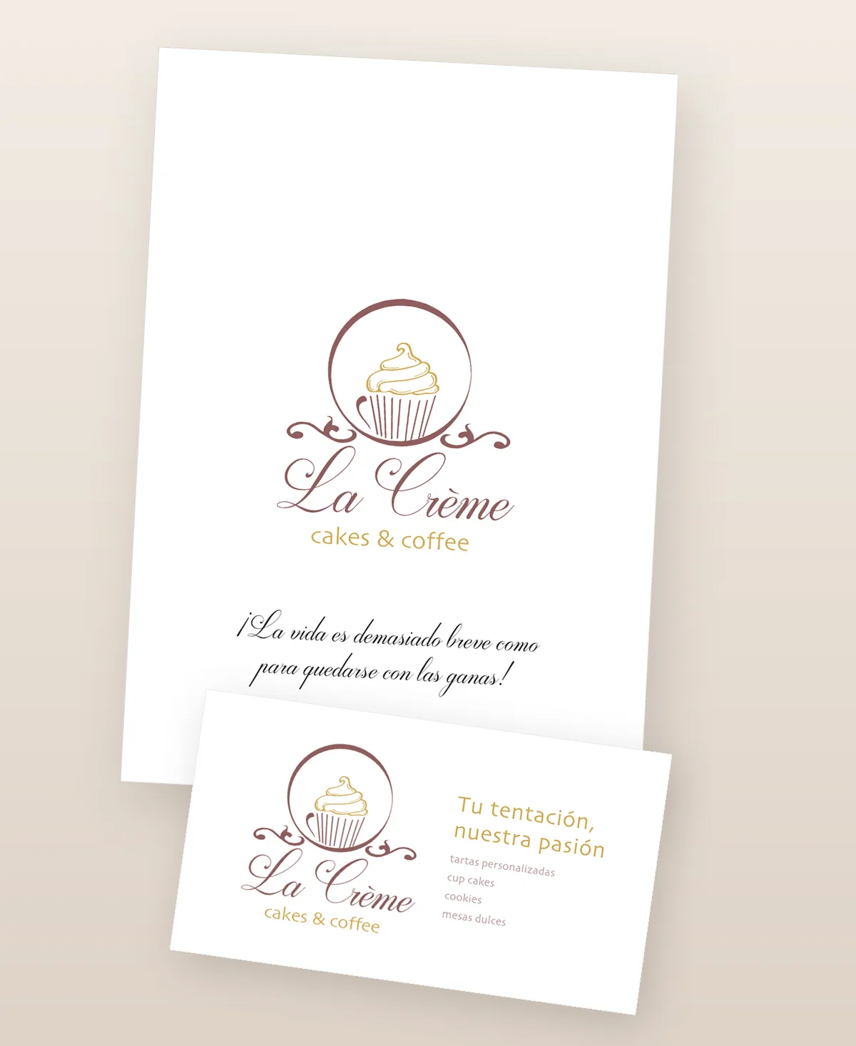
The job was not a logo. It was everything people see before they taste a cake: the card that order customers take away, the menu on the table...
The starting point
What had to be solved before drawing anything.
What we did
The full identity, handed over in one folder and explained in a manual.
A script with character for «La Crème» and a sober sans for «cakes & coffee», which is what stops the whole thing turning romantic. Burgundy and gold, in vector, with positive, negative and single-ink versions.
Typefaces, exact colour in RGB, CMYK and hex, logo usage, the business card specified point by point, and the details of the email setup. The document that lets a brand survive its suppliers.
Front with the logo and what they do; back with the details, the social profiles and a QR to the site. Print-ready artwork, not a JPG.
In Word and PDF, header and footer already built, so they could write quotes and letters without dismantling the brand every time they opened the computer.
The coffee shop menu and the Casual Food one, in Spanish and English, with their terrace version. Laid out from the start and updated every season from 2016 without ever starting again.
The result
The identity ended up on things that were never in the original brief: the shopfront sign, the window vinyl, the mugs, the glasses, the Christmas cakes, the social profiles and every new seasonal menu.
Keep looking
Let's start with something simple
Tell us what you need and we will tell you what we would do, what it would cost and how long it would take. Fixed quote before we start, free and with no strings.
Monday to Friday, 10:00 to 20:00 (Canary Islands time)